Saturday, November 10, 2012
Friday, November 9, 2012
Sunday, May 13, 2012
Happy Mother's Day!
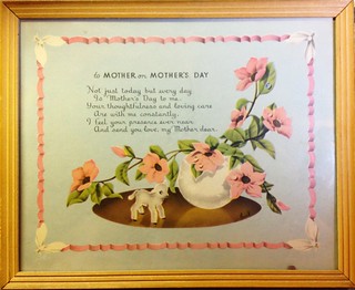
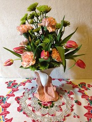
Here's a sweet message for all Moms today. I found this lovely vintage illustrated and framed poem at a neighborhood antique store, Magnolia And Willow, just in time for Mother's Day. Another found treasure at the same store was this lily shaped vase. I filled it with fresh flowers to give to Mom today.
Sunday, April 29, 2012
New! iPhonography Page
Just added! Check out my new iPhone art page.
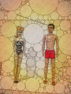
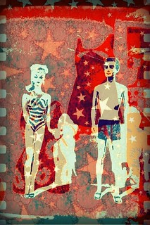
Pop Culture Icons from my childhood.
Thanks for checking them out!
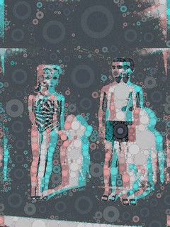
Pop Culture Icons from my childhood.
Thanks for checking them out!
Thursday, April 26, 2012
Waiting For Mr. Right
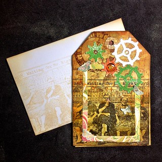 Here is a Birthday Card I made for a family member. This is the front and matching envelope. Gears were cut from glitter and metallic cardstock with Sizzix Vagabond with dies from Tim Holtz. Wrinkle Free Distress technique was created with Ranger Distress inkpads. Rubber stamp image "Waiting for Mr. Right 1938" is from Lost Coast Designs.
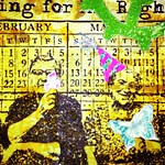 |
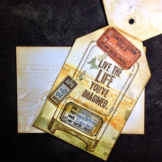
| Detail of last minute additions. |
Live The Life You’ve Imagined
Sunday, April 15, 2012
House To Die For
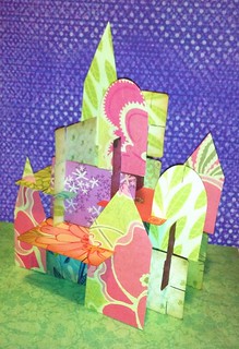
Fun with Sizzix dies and a Vagabond.
This started as a test run to create a set of cards inspired by the decks I had as a kid, that were designed by famed California designer Charles Eames. I used an ATC die to cut the shapes out of double-sided patterned cardstock, then hand cut identical slots on the ends of each card. As an after thought, as long as I had the Vag out, I cut some more shapes using the Artful Dwellings die from leftover paper as I hadn't tried it yet. I started putting the cards together to form a structure to see if my slot measurements would work. Losing myself in the fun of it, I had built a new modern "house of cards" complete with arch and steeple shapes before I knew it.
As a child, these two card sets, one large and one small, were probably the single most influential creative "toys" I played with. They imprinted my young brain with patterns, colors and aesthetics that have contributed to forming career and design choices all my life. I have my Mom to thank for that due to her interest in Eames and selecting these for my playthings, young and uncoordinated as I was.
My memories of them were recently refreshed when Mom and I went to the California Design, 1930–1965: "Living in a Modern Way" show at LACMA. Our main purpose that day was to see In Wonderland: The Surrealist Adventures of Women Artists in Mexico and the United States, where works by Frida Kahlo and others were on display. The CA show was a real bonus featuring furniture and textiles by Charles and Ray Eames and other iconic designers as well as interiors, graphic design, housewares, appliances, Barbie & Ken with the first Dream House and even a full size Airstream trailer! Alas, the gift shop was sold out of the medium sized reproduction set of cards but they can still be ordered online from LACMA or Eames Gallery.
The gears in my brain have been whirring ever since though about making my own custom set. The possibilities are many... think of a custom set of photos for a family member separated by distance, a set with images and words of encouragement, an artist's portfolio, limited edition sets. The proportions of the ATC shape may be slightly different but worked well. While I can't publish the exact measurements of the slot locations due to possible copyright infringement, it's easy enough to Google images of the cards and figure out something similar.
Thursday, April 12, 2012
Thanks For The Memories, Tim!
Sunday, April 8, 2012
Happy Easter!
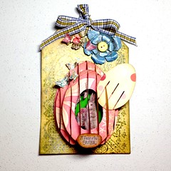
Easter Card features a 3D pop-up egg with a hidden surprise. Remove the smallest front egg by sliding it up to reveal a miniature Spring scene. Techniques used are spritz/flick distress background, then Perfect Distress stamped image. The flowers are die-cut on Bazzill card stock with Sizzix Vagabond. Easter bunny and text are from Ideaology Seasonal paper, embellished with Stardust gel pens. The 3D egg is hand cut from double-sided patterned paper using a template from Some Assembly Required, designed by Sandy Jackson. The edges of the egg pieces are lightly distressed with inkpads and tool then spritzed with Perfect Pearl Mist, Heirloom Gold, after assembled. It actually will fold flat for mailing. Tiny butterflies are stamped, cut out then glued on egg edges and flowers. I have learned so much from this class and hope to keep going. Thanks for looking!
Kids, Don’t Try This At Home
 Just in case you're thinking everything here looks perfect, here's a sneak peek behind the scenes. I had this brilliant idea to use thin craft foam instead of paper for my Easter egg card. After a couple of hours trying to assemble the darn thing I finally gave up. It seems that the tension of paper is necessary and craft foam just doesn't work for this.
"Capt'n, there's been a Transporter accident. What beamed up from the planet didn't live long!"
Thursday, April 5, 2012
Birthday Card & Birdhouse
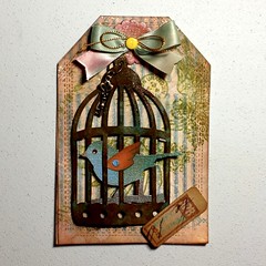
 Here's a Birthday Card and gift I made for my friend using my new skills from the Creative Chemistry 101 class. I filled the purchased birdhouse with potpourri which is where the flower and butterfly came from. The butterfly is attached with glue and the flower is just wedged behind the bird. I added the Littlest Pet Shop bird by tying it on to the perch and it fit just perfect as well as can be removed.
The die-cut bird and cage, on light blue Bazzill cardstock with Sizzix Vagabond, uses the rusted enamel distress ink technique. Distress Stickles gives a little texture and shine to the matt cardstock. The ribbon bow was hand dyed with distress ink from pads and glued on rock candy distressed medallion. A little Perfect Pearl was water misted on bird. A key charm was added with jump rings to the top of the cage. The small Date ticket was stamped on Kraft resist paper and distressed. I found these pre-cut tag-shaped cards with envelopes at Michaels.
Birthday Card
This is a Birthday Card I made for my friend using Distress Techniques I learned from Tim Holtz Creative Chemistry class.
I also entered it into the 12 Tags of 2012 - April project since it fit the theme and materials used.

I also entered it into the 12 Tags of 2012 - April project since it fit the theme and materials used.

Wednesday, April 4, 2012
Perfect Pearls Distress
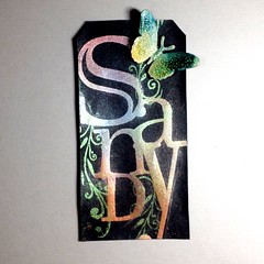
Typographic treatment of my name using the Perfect Distress Technique from Day 9 of Tim Holtz's Chemistry 101 online class. This tag on black cardstock was stamped with Distress embossing ink with some foam letter stamps. The lower case "n" is mounted crooked on the base but I decided it's just showing some "character" and so did not bother trying to straighten it. The butterfly was another attempt from Day 8's rock candy crackle on pre-cut cardboard shapes from Michaels.
Day 10 - THCC 101
Distress Stickles Technique.
I can't believe this is the last day's project. This class has been so educational. I haven't done this much stamping at one time ever. All three of these tags use color Distress Stickles (Straw, Spiced Marmalade, Fire Brick Red - set) rather than the clear Distress Rock Candy Stickles although it's hard to see in the photograph. The butterfly is another attempt at Day 8's lesson. I had the hardest time with the Rock Candy Crackle. I was being oh so patient with letting them slow dry. They were looking beautiful until they were dry and all the crackle was flaking off! I think it was because these were pre-cut cardboard shapes that I applied Snow Cap pigment ink and Perfect Pearl layers before I put the crackle on. One or both of these seemed to resist the Rock Candy (more like repelled!) once it was dry. In an attempt to save them, I put another layer on, heat dried and then put some alcohol inks on as I don't have any re-inkers or stains yet.

I can't believe this is the last day's project. This class has been so educational. I haven't done this much stamping at one time ever. All three of these tags use color Distress Stickles (Straw, Spiced Marmalade, Fire Brick Red - set) rather than the clear Distress Rock Candy Stickles although it's hard to see in the photograph. The butterfly is another attempt at Day 8's lesson. I had the hardest time with the Rock Candy Crackle. I was being oh so patient with letting them slow dry. They were looking beautiful until they were dry and all the crackle was flaking off! I think it was because these were pre-cut cardboard shapes that I applied Snow Cap pigment ink and Perfect Pearl layers before I put the crackle on. One or both of these seemed to resist the Rock Candy (more like repelled!) once it was dry. In an attempt to save them, I put another layer on, heat dried and then put some alcohol inks on as I don't have any re-inkers or stains yet.
Day 9d - THCC 101
Perfect Distress & Mist Technique
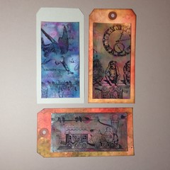
All three of these tags used the Perfect Distress technique. The last tag on the right used the Perfect Distress Mist on the background as well. I didn't have any re-inkers to make a distress ink mist so just mixed PP Kiwi in water and sprayed after doing a wrinkle-free distress. Then I stamped the peacock feather with Distress markers direct from the stamp. The image didn't hardly take as the mica must have resisted it. So I drew over it with more markers, colored pencils and opaque paint markers. Then I added some more pearl bling. The middle tag used some foam letter stamps I have with Distress embossing ink. The butterfly was another attempt from Day 8's rock candy crackle.
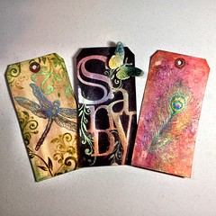
All three of these tags used the Perfect Distress technique. The last tag on the right used the Perfect Distress Mist on the background as well. I didn't have any re-inkers to make a distress ink mist so just mixed PP Kiwi in water and sprayed after doing a wrinkle-free distress. Then I stamped the peacock feather with Distress markers direct from the stamp. The image didn't hardly take as the mica must have resisted it. So I drew over it with more markers, colored pencils and opaque paint markers. Then I added some more pearl bling. The middle tag used some foam letter stamps I have with Distress embossing ink. The butterfly was another attempt from Day 8's rock candy crackle.
Day 9c - THCC 101
Perfect Distress & Mist Technique.
Here's a close-up of the peacock feather stamp with not so much light reflecting on the iridescent shine of the mica powders. I mixed just PP Kiwi in water without any ink and sprayed after doing a wrinkle-free distress. Then I stamped the peacock feather with Distress markers direct from the stamp. The image didn't hardly take as the mica must have resisted it. So I drew over it with more markers, colored pencils and opaque paint markers. Then I added some more pearl bling.
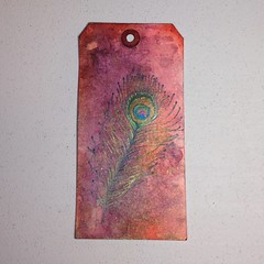
Here's a close-up of the peacock feather stamp with not so much light reflecting on the iridescent shine of the mica powders. I mixed just PP Kiwi in water without any ink and sprayed after doing a wrinkle-free distress. Then I stamped the peacock feather with Distress markers direct from the stamp. The image didn't hardly take as the mica must have resisted it. So I drew over it with more markers, colored pencils and opaque paint markers. Then I added some more pearl bling.
Day 9b - THCC 101
Day 9a - THCC 101
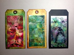
Perfect Splatter & Distress - The two outer tags are the Perfect Splatter technique, and the middle one is Perfect Distress. The tag on the left was 1st and the one on the far right was 2nd generation from the same ink/PP puddle. It was difficult to get a photograph showing the luminescence of the mica powders. I LOVE the PP color Kiwi. The 1st class is over now but anyone can sign-up for it now and take it anytime.
Day 8c - THCC 101
Shattered Stains & Paint Resist
For the middle manilla tag, I used white acrylic paint dabbed directly on the stamps with cut n dry foam. The two tags on the outside are the rock candy crackle paint resist. I use the really cheap craft foam from the 99 Cent Store to hand cut the shapes. It came out... interesting. The foam is thinner than regular craft foam and has a soft flexible feel to it like leather suede. I'm wondering if it could be used to make faux leather bracelets. It didn't melt from the heat gun but could have potentially burned if was used too long. The crackle paint was barely dry so has a thin crazing to it. I stained it with Adirondack alcohol inks as I didn't have stains or re-inkers, fun to watch!

For the middle manilla tag, I used white acrylic paint dabbed directly on the stamps with cut n dry foam. The two tags on the outside are the rock candy crackle paint resist. I use the really cheap craft foam from the 99 Cent Store to hand cut the shapes. It came out... interesting. The foam is thinner than regular craft foam and has a soft flexible feel to it like leather suede. I'm wondering if it could be used to make faux leather bracelets. It didn't melt from the heat gun but could have potentially burned if was used too long. The crackle paint was barely dry so has a thin crazing to it. I stained it with Adirondack alcohol inks as I didn't have stains or re-inkers, fun to watch!
Day 8b - THCC 101
Acrylic Paint Resist
This is white acrylic paint dabbed directly on to stamps, applied to sticky-back canvas. I used Distress inkpads to direct stain the canvas and water. I can see how the Distress Stains would be easier to use for this technique. The canvas doesn't like to absorb the ink too much and has a grainy look.
This is white acrylic paint dabbed directly on to stamps, applied to sticky-back canvas. I used Distress inkpads to direct stain the canvas and water. I can see how the Distress Stains would be easier to use for this technique. The canvas doesn't like to absorb the ink too much and has a grainy look.
Day 8a - THCC 101
Crackle Paint Resist
It worked as expected. It can be tough to stamp a detailed design over the thick dried crackle paint. Rubber stamp images are from Lost Coast Designs and Tim Holtz Collection.
It worked as expected. It can be tough to stamp a detailed design over the thick dried crackle paint. Rubber stamp images are from Lost Coast Designs and Tim Holtz Collection.
Day 7b - THCC 101
Distress Powder Resist Embossing
I'm still working on getting this technique down. I think maybe I'm heating it too long. The tag on the right was the first one I did and I wasn't happy with it. Then I did the next one on the left and liked it better. But the two seemed to look nice together, one completes the other like Yin and Yang. This one will be a do over to try to get it right another time.
I'm still working on getting this technique down. I think maybe I'm heating it too long. The tag on the right was the first one I did and I wasn't happy with it. Then I did the next one on the left and liked it better. But the two seemed to look nice together, one completes the other like Yin and Yang. This one will be a do over to try to get it right another time.
Day 7a - THCC 101
Nostalgic Batik & Rusted Enamel Technique
The first tag on the left was a do-over as I really didn't like my first effort. I will work some more on this technique as I like the principle. I don't think my stamp choice works with the colors. The tag on the right came out really cool, first try! But this is all for learning and want to save my energy for the next lesson.
The first tag on the left was a do-over as I really didn't like my first effort. I will work some more on this technique as I like the principle. I don't think my stamp choice works with the colors. The tag on the right came out really cool, first try! But this is all for learning and want to save my energy for the next lesson.
Day 6 - THCC 101
Distress Markers
Watercolor (far left and far right) and direct color on stamp techniques (middle). I used Inkssentials gloss paper as I didn't have the specialty stamp paper. Opaque paint marker created the white spots.

Watercolor (far left and far right) and direct color on stamp techniques (middle). I used Inkssentials gloss paper as I didn't have the specialty stamp paper. Opaque paint marker created the white spots.
Day 5 - THCC 101
Stamping with Stains, Stained Kraft Resist, Marbled Stains.
I didn't actually have all the materials (stains, kraft resist) required for this day's lesson so I came up with some workarounds. This enabled me to first, at least go through the steps to understand the lessons. Second it challenged me to come up with alternate media in my stash that have similar chemical properties and might produce similar results. I substituted white acrylic paint and distress inkpads for the first and last tags. The middle Kraft Resist was the least successful as far as demonstrating the lesson however I'm pleased with the final outcome. I didn't have any Kraft Resist paper so used Seasons scrapbook paper with clear embossing. It did not resist the Archival ink at all (duh!) so I used stamp cleaner to wipe some off. This also blurred the stamped image a little which gave it an interesting quality. I really want to try this when I have the chance to pick up the right paper.
I didn't actually have all the materials (stains, kraft resist) required for this day's lesson so I came up with some workarounds. This enabled me to first, at least go through the steps to understand the lessons. Second it challenged me to come up with alternate media in my stash that have similar chemical properties and might produce similar results. I substituted white acrylic paint and distress inkpads for the first and last tags. The middle Kraft Resist was the least successful as far as demonstrating the lesson however I'm pleased with the final outcome. I didn't have any Kraft Resist paper so used Seasons scrapbook paper with clear embossing. It did not resist the Archival ink at all (duh!) so I used stamp cleaner to wipe some off. This also blurred the stamped image a little which gave it an interesting quality. I really want to try this when I have the chance to pick up the right paper.
Day 4 - THCC 101
Watercolor Re-inkers & Layered Misting
I thought about not doing the projects for Days 4 & 5 because I didn't have the supplies necessary but instead decided to try workarounds to at least go through the steps to understand the principles. This challenged me to come up with alternate media in my stash that have similar chemical properties and "might" produce similar results. For the first tag on the left, I used distress ink stamped on my kraft sheet and picked it up with a waterbrush. For the second tag, instead of misting, I used the blending tool with distress inkpads and stencils.
I thought about not doing the projects for Days 4 & 5 because I didn't have the supplies necessary but instead decided to try workarounds to at least go through the steps to understand the principles. This challenged me to come up with alternate media in my stash that have similar chemical properties and "might" produce similar results. For the first tag on the left, I used distress ink stamped on my kraft sheet and picked it up with a waterbrush. For the second tag, instead of misting, I used the blending tool with distress inkpads and stencils.
Day 3d - THCC 101
Reflections Stamp/Embossing
This was the closest embossing texture fade I had that had enough open space to stamp in. I also didn't have a Reflections stamp so used a pattern that was reversable. I mainly just wanted to learn the principle. I'm anxious to see Tim's new texture folders that have shapes to block out the emboss. I'm still real new at using the Vagabond and need to have more confidence with it so this really helped.
This was the closest embossing texture fade I had that had enough open space to stamp in. I also didn't have a Reflections stamp so used a pattern that was reversable. I mainly just wanted to learn the principle. I'm anxious to see Tim's new texture folders that have shapes to block out the emboss. I'm still real new at using the Vagabond and need to have more confidence with it so this really helped.
Day 3c - THCC 101
Archival Resist
As with Days 4 & 5, I did not have all the supplies necessary for this lesson so tried some workarounds to learn the steps for future use. For both tags, I used Caran d'Ache Nupastels to draw the resist elements. This particular oil pastel is unlike any other brand in its properties. I fell in love with them after taking a journaling workshop with Teesha Moore so bought a set. I also learned media that doesn't work well on gloss paper, wax-based colored pencils (Prismacolor), and wax crayons. The first tag on the left was least successful as far as reproducing the lesson however I love how it came out! I tried using Snow Cap pigment ink instead of Archival which did resist a little. The image is not a stamp but a one of a kind vintage metal printing plate for an ad that maybe came from the 60's. I didn't know if it would produce an image or not. I inked it up and layed the paper on top of it rather than trying to stamp it. I ended up drawing with Nupastels on top as the resist was faint.
As with Days 4 & 5, I did not have all the supplies necessary for this lesson so tried some workarounds to learn the steps for future use. For both tags, I used Caran d'Ache Nupastels to draw the resist elements. This particular oil pastel is unlike any other brand in its properties. I fell in love with them after taking a journaling workshop with Teesha Moore so bought a set. I also learned media that doesn't work well on gloss paper, wax-based colored pencils (Prismacolor), and wax crayons. The first tag on the left was least successful as far as reproducing the lesson however I love how it came out! I tried using Snow Cap pigment ink instead of Archival which did resist a little. The image is not a stamp but a one of a kind vintage metal printing plate for an ad that maybe came from the 60's. I didn't know if it would produce an image or not. I inked it up and layed the paper on top of it rather than trying to stamp it. I ended up drawing with Nupastels on top as the resist was faint.
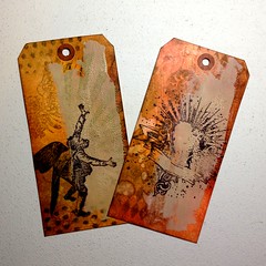
Day 3b - THCC 101
Alcohol Ink Agates
For the metal mixative, I used silver because that's what I had in my stash. I really had fun with this technique and spent a whole day on it. It's hard to get a good photo of these to show the beautiful pearly luminescence and vivid colors of the ink.
For the metal mixative, I used silver because that's what I had in my stash. I really had fun with this technique and spent a whole day on it. It's hard to get a good photo of these to show the beautiful pearly luminescence and vivid colors of the ink.
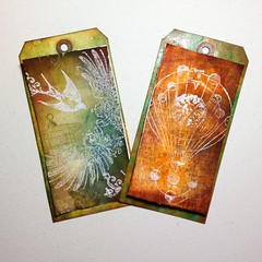
Day 3a - THCC 101
Alcohol Ink Agates
For the metal mixative, I used silver because that's what I had in my stash. I really had fun with this technique and spent a whole day on it. It's hard to get a good photo of these to show the beautiful pearly luminescence and vivid colors of the ink. Rubber stamp images are from Lost Coast Designs and Tim Holtz Collection.
For the metal mixative, I used silver because that's what I had in my stash. I really had fun with this technique and spent a whole day on it. It's hard to get a good photo of these to show the beautiful pearly luminescence and vivid colors of the ink. Rubber stamp images are from Lost Coast Designs and Tim Holtz Collection.
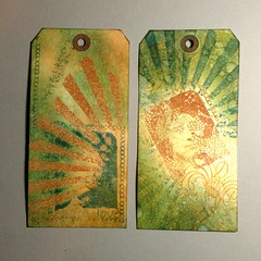
Day 2c - THCC 101
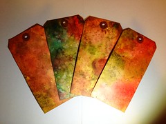
Blended Distress/Spritz Flick Technique
Technique learned from Tim Holtz Creative Chemistry 101 class.
Technique learned from Tim Holtz Creative Chemistry 101 class.
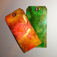
Day 2b - THCC 101
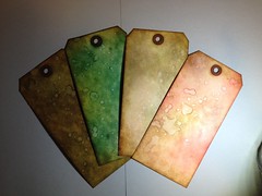
Wrinkle-Free Distress Technique
Technique learned from Tim Holtz Creative Chemistry 101 class.
Technique learned from Tim Holtz Creative Chemistry 101 class.

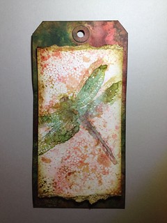
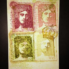
Day 1 - THCC 101
One of my Creative Chemistry 101 Class 1 experimentations using one stamp plus crown stamp, 4 different inkpads, Strathmore Windpower coldpress watercolor paper. The inks are from top clockwise Adirondack - Raisin (dye), Colorbox Fluid Chalk - Coral Rose (dye), Memories - Soft Celery (dye), Distress - Peeled Paint (dye). Also used are Distress Markers, waterbrush, spray water bottle, craft sheet. I was pleasantly surprised as I never thought of stamping on watercolor paper before and I really like it!
It's been awhile!

I just finished an online class with Tim Holtz so now I'm a graduate! It's been great fun. I did more stamping and inking than I have ever and learned so much!
Tuesday, February 14, 2012
Happy Valentine’s Day!
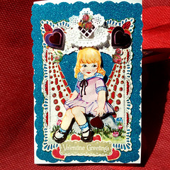
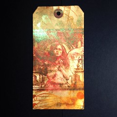
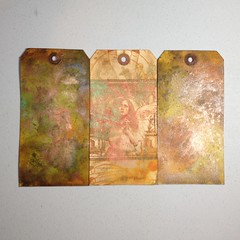
Valentine card I made for my Mom. Front of card features glitter paper background, metallic heart stickers, paper doilies, 3 dimensional girl with foam relief from vintage ephemera cd. The entire card is very intricate requiring a lot of scissor cutting!


Inside the Valentine card is a 3D pop-up heart tied closed with a red ribbon. The Medium heart is hand cut from a template design by Sandy Jackson from Some Assembly Required. The heart opens to reveal a scene of vintage collage elements within the heart “tunnel.” I re-engineered the design myself to have a gatefold and hollowed out center similar to her egg design.
Inside the Valentine card is a 3D pop-up heart tied closed with a red ribbon. The Medium heart is hand cut from a template design by Sandy Jackson from Some Assembly Required. The heart opens to reveal a scene of vintage collage elements within the heart “tunnel.” I re-engineered the design myself to have a gatefold and hollowed out center similar to her egg design.
Subscribe to:
Posts (Atom)