
Monday, June 29, 2015
Day Twenty-Nine – The Dead Tell Tales
Sunday, June 28, 2015
Day Twenty-Eight – Forests and Firebirds
"The stimulus for any individual listening to music, fully engaged, with their imagination working, is really what this is all about." —James Levine on Fantasia 2000

All of the segments are fantastic but these two are the ones that really stood out for me.
Saturday, June 27, 2015
Day Twenty-Seven - Rhythm and Hues
 |
| Top left drawing of Gershwin by Al Hirschfeld. Top right cell from Fantasia 2000 by Eric Goldberg. All others are from film also. |
"Fantasia was an Harmonic Convergence of Idea, Music and Artist."This interesting quote came from the DVD extras, concerning The Steadfast Soldier but I think it applies to the entire film.
Friday, June 26, 2015
Day Twenty-Six – All Tangled Up

Thursday, June 25, 2015
Day Twenty-Five – Tiny Dancers
According to Kandinsky, "Blue is the colour of spirituality: the darker the blue, the more it awakens human desire for the eternal."
 I created another zen chalk mandela drawing in the morning to add to yesterday's seven. Then went through some stamps I've been wanting to use but didn't have time for. I settled on a pair of ballet dancers, an architectural feature and a postal. Then for paper, I chose some shimmer cardstock in eggshell and coral, and some flecked vellum. The dancers were stamped with a blend of distress ink pads in chipped sapphire, dusty concord and tumbled glass. I also spritzed with water on some. Then I stamped the building on old book papers. I wasn't happy with it not showing up well on the black type so got some stencils out and applied some contrasting colors with iced spruce, peeled paint and wild honey. I also misted with some water to soften and dabbed some white picket stain. I'm not sure if I'll use the vellum but at least the images stamped with distress ink did dry as some vellum does not take ink well. Eventually these will be used for ATCs.
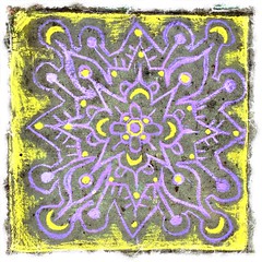 |
| Chalk Mandela |
Wednesday, June 24, 2015
Day Twenty-Four – Taking It To The Streets
"All means are sacred which are called for by the inner need."
—Wassily Kandinsky

Speaking of music, I found it was difficult not to feel energy listening to Paul Simon's Graceland which is why I included it in yesterday's post title. The text was already getting long so I'm mentioning it today instead. There is just something joyful about South African rhythms.
Tuesday, June 23, 2015
Day Twenty-Three – Going To Graceland
"That is beautiful which is produced by the inner need, which springs from the soul." —Wassily Kandinsky

While it may bear a striking resemblance to another current popular B&W style, this is actually a type of drawing I've been doing for many years since I was a teen before there was a clever name, how-to courses and branded art media. I have my original sketchbooks to prove it. At the time, I was inspired to learn how to draw the ornate paisley fabric patterns many of my dresses were made of. I also was attracted to lacy crochet patterns. Later, the activity was relegated to helping me stay awake during staff meetings and phone calls. The kinetic activity also helped map my memory to the meeting information. I never took it seriously but it was always very therapeutic. Without a fancy name, it was little more than an excercise in line and repetition, otherwise called "doodling." My art teachers didn't encourage it however many of my art classmates like me just intuitively drew them but with their own personal style. It was more a spontaneous art style of the psychedelia hippie era.
I suppose like the genre of steampunk existed before it had a label, it was only a matter of time before this drawing style would be blessed with a name too. I just wish I had thought of it! But I also never thought that there would be mass interest in it or that it could be "taught" at all. It always felt like it was my personal style and mine alone. So Kudos to those with the vision to do so!
Monday, June 22, 2015
Day Twenty-Two – Brain Freeze
It's been three weeks since I started this daily commitment and the first day I experienced a complete creative mental block. I finally put my distracting phone and it's social media minions in time-out while picking up a craft magazine I'd already read. Then looking for something better to read and giving up on being creative for the day, fate had me pick up "Concerning the Spiritual in Art" by Wassily Kandinsky I had purchased at LACMA last year. Pretty cerebral stuff and too many concepts to discuss in this lowly blog post. But I tried to look for some helpful information for lifting my "petrified barriers" today. I ended up also turning to his essay, "On the problem of form."
Here's a few principles.
Kandinsky likes to operate in threes and triangles.
It is every artist's responsibility to:
1. Express his inner need and talent to create art
2. Help create a spiritual atmosphere through thoughts, feelings and actions
3. Shape and modify the spiritual atmosphere for the improvement of humanity.
What blocks the "good fertilizing white ray of creativity by the evil black death-bringing hand" of destruction:
1. Fear of the clear path (evolution of art)
2. Fear of freedom (allowance of new ideas)
3. Deafness to the spirit (haters, negative thoughts)
The barriers must be removed to allow the creative urges from the internal Abstract Spirit (content) to transform the external material (form). "The most important thing in the question of form is whether or not the form has grown out of the inner necessity." I guess I wasn't feeling the Spirit today. But my headache and stiff neck/shoulder is feeling better! Thank you Kandinsky.
 |
| Free Curve to the Point - Accompanying Sound of Geometric Curves Ink on paper - 1925, Wassily Kandinsky image from the Metropolitan Museum of Art |
Kandinsky likes to operate in threes and triangles.
It is every artist's responsibility to:
1. Express his inner need and talent to create art
2. Help create a spiritual atmosphere through thoughts, feelings and actions
3. Shape and modify the spiritual atmosphere for the improvement of humanity.
What blocks the "good fertilizing white ray of creativity by the evil black death-bringing hand" of destruction:
1. Fear of the clear path (evolution of art)
2. Fear of freedom (allowance of new ideas)
3. Deafness to the spirit (haters, negative thoughts)
The barriers must be removed to allow the creative urges from the internal Abstract Spirit (content) to transform the external material (form). "The most important thing in the question of form is whether or not the form has grown out of the inner necessity." I guess I wasn't feeling the Spirit today. But my headache and stiff neck/shoulder is feeling better! Thank you Kandinsky.
Sunday, June 21, 2015
Day Twenty-One - What A Lovely Day

Saturday, June 20, 2015
Day Twenty – Strange Fruit
My creativity energy today was focussed on setting up our Apple TV. The main incentive came from having missed the first episode of Jonathan Strange & Mr. Norrell, a new mini series on BBC. It was available on demand but only in SD. We're so spoiled by HD. I tried recording a repeat broadcast but it turned out to be an error in the guide. Hearing that it was available on YouTube, I hoped Apple TV would save me from having to watch on computer or tablet and it did! It was easy to set-up and the streaming YouTube video was full screen crystal clear HD quality.
I really liked the show so far. It takes place in early 19th century Britain as if magic was real, just not considered reputable. It is based on the Hugo Award winning book by Susanna Clarke. It seemed a little slow but when this male bad faery character appeared I almost thought David Bowie's Goblin King role had been reprised. Like some other shows about magic, such as Once Upon A Time, we get a sense that magic always comes with a price.
 |
| Jareth, The Goblin King |
I really liked the show so far. It takes place in early 19th century Britain as if magic was real, just not considered reputable. It is based on the Hugo Award winning book by Susanna Clarke. It seemed a little slow but when this male bad faery character appeared I almost thought David Bowie's Goblin King role had been reprised. Like some other shows about magic, such as Once Upon A Time, we get a sense that magic always comes with a price.
Friday, June 19, 2015
Day Nineteen – Loose Ends
Thursday, June 18, 2015
Day Eighteen – Astrowives
Inspiration today came from the past. I took a trip down memory lane while watching the TV series debut of The Astronaut Wives Club based on the book by Lily Koppel. Having grown up a few miles from one of the main aeronautics firms in this country that designed and manufactured everything from rockets, Apollo capsules to space shuttles, the space race was ingrained in my childhood memories. I remember standing on the playground in elementary school and seeing a block long rocket being transported on a flatbed. Our own 60's neighborhood coffee klatch included space race engineer wives.
 I couldn't help thinking of my mother and how she would have loved this show. She was always a big proponent of the space program. The show focuses on the women behind the first American spacemen and their stories. I like the way it shows their strength while having to conform to the gender roles expected of them at the time. The space race is portrayed as an American PR program as much as the arms race and how the U.S. of A. HAS to be the first and best in everything ahead of the Russians. The wives are recruited to promote the apple pie image further. Of course there's a certain amount of Real Housewives melodrama to make it interesting. I don't know how accurate the wives' stories are but I plan on reading the book to find out more. The astronauts seem to be treated like precursors to modern major league sports celebrities with cars, parties and women while their wives both compete and cling together for support. In that era, a woman's accomplishments were tied to her husband's success, not her own.
It's also nice knowing ahead of time that there will be 10 episodes. So I can watch it without worrying about it being yanked off the air after 3 episodes or ending unfinished due to cancellation. The series will move quickly to span the 60's decade up to the first man on the moon that exactly coincides with my child and teen years. I'm looking forward to future episodes.
Wednesday, June 17, 2015
Day Seventeen – Pop Card
I finished my special card today but am still keeping it under wraps for the reveal after it has arrived. (Updated photo, card has been received.) After hand writing a sentiment on the center panel, I assembled all components into the stand-up card. I also added a stringed banner with stamped letters. It was hard finding the right place for it without hiding the art or interfering with the card folding functions. Then I made a belly band to keep it contained in the envelope. I found the best way to handle this type of pop-up is by holding the outer left and right oval edges like a book and pulling them straight outwards. My card does fold up like an accordion for mailing.

Tuesday, June 16, 2015
Day Sixteen – Look Oval There
I am almost finished with the special card I am making. I am hoping to get it in the mail tomorrow.
 Yesterday I cut out the parts for the 3D accordion oval card with dies designed by Karen Burniston for Elizabeth Craft Designs.
 Today I stamped two B.Kliban cat images on watercolor paper with Ranger black archival ink. Then I colored them with distress markers using a watercolor technique. After stamping a cloud background, I cut out oval shapes with dies included with the die set. I'm keeping photos of the images under wraps so they are a surprise to the recipient!
 Here are the parts cut out and partially assembled. To be continued...
Monday, June 15, 2015
Day Fifteen – We Are Stardust

I somehow became the adoptive Mother Earth to plants from several of my friends who couldn't take their office plants with them when they left. It's really cool because now every time I water or look at those plants, I think of that friend as living reminders of those memories.
 |
| The new cuttings are center and right. The plumeria on the left is from a cutting planted several years ago. |
I thought it was really a great idea what my friend did with her plumeria plants she had at home. Before moving the family to Texas, where her potted plumerias might not adapt so well, she took several cuttings and divided them among friends rather than throwing them away. Hopefully, the cutting I planted today will bloom white flowers one day as beautiful as hers did. The other cutting was from a really big plumeria tree on my block with pretty pink flowers. I found a piece that had fallen on the ground so I rescued it from being trashed.
I also started a card for a special person to mail before an upcoming holiday. I mainly just picked out the paper which is sometimes the hardest part for me. Then I die cut the components for a 3D accordion fold card so I can really get started on it tomorrow.
Sunday, June 14, 2015
Day Fourteen – Game Changer

It was necessary today to take care of the business of updating and creating my work history and job skills online profile. For some reason, a web designer is lumped into the category of Entertainment, Multi-Media and Animators so many of the job specific skills did not fit my experience. There was also an excercise designed to identify what jobs I may be qualified for by arranging 20 statement cards by most to least important. According to the points score awarded, I have 3 out of 4 points to be a gamer change cashier and half the 40 points necessary to be an art director. I also scored high for copywriter/proofreader which there seems to be a lot of positions available for. But there were zero job listings available for web developers. Arcade change person? I don't think so!
Saturday, June 13, 2015
Day Thirteen – Fair Trade
I completed 15 artist trading cards for my Long Beach ATC group that meets at Lyons Art Supply downtown. I took the remaining card parts and worked on a few more for future trades at the meeting. Lunch, lively conversation and trading cards with eleven other artists makes it a little distracting for getting too much done so I just take enough to keep busy. We also walked to a nearby recycle store, LB Depot for Creative ReUse, where I picked up a few things including what looked like accordion folded drapery samples that I can see using for binding pages in for handmade books and journals.
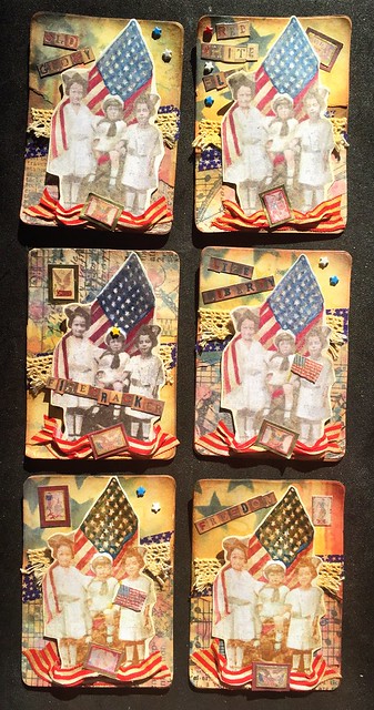
 The theme this month was "red, white and blue." Pictured above is a summary of the steps from Days Ten, Eleven and Twelve to make the cards and a closer view of three finished cards.

Here are all 15 card variations created. I used Tim Holtz Seasonal paper to cut out tiny embellishments and Sakura gel pens to add accents here and there. The cards were met with some nice comments from the group. I came home with a really nice collection of traded cards which almost everyone stuck to the theme.
.
Friday, June 12, 2015
Day Twelve – Red, White, Blue
I spent most of today finishing 15 artist trading cards for Saturday's meeting which should be enough. I will have 5 to work on at the meeting to have a few leftover for the Carson Rubber Stamp Convention ATC trade in July.
 Shown here are my collage sheets printed from my original hand stamped and colored images. I adhered them to cream cardstock with Golden matte medium then roughly separated them. Then each was cut out with more detail.
 Here's another shot of the assembly line adding washi, fabric and lace tape. I used distress ink and blender to age the trims a bit. With some family feedback, I decided to place the star and lace trims horizontally behind the main images instead of vertically. Bubble wrap scraps were adhered to backs to add some dimension.
They always take longer than I estimate when having to do several at a time. I will post a photo of the finished variations tomorrow.
Thursday, June 11, 2015
Day Eleven – Seeing Stars
Continuing with working on my June artist trading cards for Saturday, I cut out the patterned and layered tissue papers from yesterday. I chose a kraft brown cardstock for the backing. It's easy using Sizzix die #656332 for cutting several cards with rounded corners.
 Then I tore the cut out cards with the two different patterned papers roughly on a diagonal to be combined, gluing them to the cardstock with Golden matte medium.
 Next I began trying out some ideas with stencils, distress ink and some fabric and washi tape. I had previously stamped a vintage image of children with a flag for a July 4th holiday theme of red, white and blue. Then I hand colored three image variations, scanned and re-sized in Photoshop to fit ATC size better. Finally, I printed a couple of sheets in color. I'm liking the way the elements are coming together. Tomorrow I'll finish assembling which is the fun part.
Wednesday, June 10, 2015
Day Ten – Tissue Transparency
I'm finally getting back today to actually doing something creative, although it was a struggle. Finishing my die organization took a lot more time than I thought and still is not complete. But at least they are all put away. I was able to start my June ATCs for this Saturday's trade. It seemed to take most of my time to gather the different materials I wanted to use, especially choose the paper patterns for the background. I chose a yellowed grunge and tiled pattern to work with.
 Then I decided to try layering Tim Holtz Melange tissue wrap. This is really strong paper and a little more opaque than I wanted, unlike gift wrap tissue. So I experimented to see if I could get it more translucent by using Golden gloss medium to adhere to my patterned paper. I also applied a light layer on top. This seemed to work pretty well but still the tissue design was a little dark so I tried sanding some to distress. This paper is really tough and took more effort than I expected! But I am happy with the result so far. The problem is however, the gloss medium will now act as a resist for distress inks so if I want to add any color, it will have to be acrylic paint instead. The sanding may have removed some so we will see.
Tomorrow I will continue with cutting out the cards and assembling. I don't have a clear idea yet so will play around as I go.
Tomorrow I will continue with cutting out the cards and assembling. I don't have a clear idea yet so will play around as I go.
Tuesday, June 9, 2015
Day Nine – Come Tuesday Morning

Monday, June 8, 2015
Day Eight – Break's Over
Boxes to Die For
It's Monday and time to get something done. Organizing is doing something creative. It is also necessary in order to know what art supplies I have and where to find them so I'm not wasting my creative time and energy looking for them. Mine have gotten a little out of control... Well, a lot really.
So I spent today pulling newer dies out of boxes and bags to make sure they were catalogued and put away in clear plastic containers I had purchased for the purpose. At some point, I felt quite overwhelmed. I was trying to convert some older containers to the newer ones but found that not only would some not fit but I didn't have enough empty ones. But little by little I was able to group like sizes and types together. I was still left with a cardboard box full but will go buy some more tomorrow. Then it should be easier to put the rest away. I found I like to use these wonderful containers from "Really Useful Boxes" available from Office Depot and Staples. The long rectangular boxes made for CDs/DVDs are just the right size for Sizzix Bigz, Originals and Embossing Folders. They stack nicely, with the lids being raised without any funny indentations in them to prevent closing. Smaller boxes are good for medium Sizzlits, smaller dies and inkpads.
Sunday, June 7, 2015
Day Seven – Rest & Rejuvenation
City of Ember
There is creativity in rest and just being. I felt the need to just relax today, on the seventh day. Rejuvenation allows us the time to renew and re-charge so we can start anew. In so doing, I watched a really interesting movie I'd not seen before which inspired me. City of Ember was the movie, cast with Bill Murray, Tim Robbins and Martin Landeau. The real stars were the young tweens Harry Treadaway and Saoirse Ronan. I didn't recognize young Harry but with additional research was delighted to find out he stars in one of my favorite TV series, as Victor Frankenstein in Penny Dreadful.
Saturday, June 6, 2015
Day Six – Ticket To Ride
It was another game learning experience tonight. I joined my fellow Steampunks of Orange County for a yummy potluck and game night, dressed in appropriate themed attire. A couple had played before but most of us were new to the railway-themed board game called Ticket To Ride – Europe version.
 The object of the game was to earn the most points to win. Players did this by building tracks in their color. Each player received different cards at the beginning that were train cards, long route and short route destination cards. With each turn, we drew two more or chose from a face-up stock pile. Players also received small plastic train cars and stations resembling houses and hotels from Monopoly, for placement on the tracks claimed. You continue to connect routes for points or to block other players. We even had prizes at the end. My teammate generously let me take home our prize, a Disney R2D2 collector pin!
Friday, June 5, 2015
Day Five – Lord of the Rings Online
I learned about something new today, at least to me. My friend gave me a tour of the online game, The Lord of the Rings And according to my original rule, this meets the criteria for a post. Plus I created a little graphic using a few iPhone apps including Pixlr and Tangled FX from screenshots so I'm covered.

There is actually a lot of creativity with this RPG. Not only are the 3D graphics and animation pretty good but you really get to customize your attire, house interior and horse accessories to create the personas of your liking. Without upgrading for real money, you can have up to three characters. The game is free to download and play, but you'll need to have a fast computer and enough hard disk space, about 20 gigs. As with most digital games, there are "opportunities" to purchase better stuff. This is historically known as the "razor and blades" business model or now as the "freebie marketing" scheme. You give or sell the product real cheap as your customers will be required to buy additional supplies to continue using it. Inkjet printers are another good example of this principle. The first time you need to replace all six or eight ink cartridges in your photo printer, you could have bought a new printer! The manufacturer knows they will make up the difference and profit with the ink cartridge sales. Anyway, this game is a lot more fun than razors and ink. It is extremely detailed and true to the universe created in Tolkien's books. You can travel all over Middle Earth experiencing the lore firsthand while completing quests to earn loot and interacting with other players.
Thursday, June 4, 2015
Day Four – Pansy Fairy
Pansy Flower Fairy

Wednesday, June 3, 2015
Day Three – Celtic Crosses and Ornate Type
I did a few things today. I started another flower fairy watercolor which I will post when finished. My daughter asked me for some help with the construction of a Celtic border pattern and how it could be done in Illustrator or Photoshop. After sending me her sketch and a similar Googled image, I began to deconstruct the design. At first I thought it would be pretty difficult but after analyzing it, I saw that it really is only a couple of repeating shapes. So I made a few simple sketches on my phone with a paint app. They are pretty rough but the shapes can be seen fairly easily.
 The letters I actually did yesterday but didn't really fit with Day Two's post. Someone at my last ATC group meeting was getting rid of this complete wood mounted rubber stamp alphabet set, Ornate Floral by Stampin' Up. Being a typophile, I couldn't let these go! Each one was stamped with black Ranger Archival ink on white cardstock. I will be scanning the stamped letters to use later for my own digital projects. Their actual size is about 5/8". There is just something cool about using rough imperfect letters with computer art.
Tuesday, June 2, 2015
Day Two – Origami Butterflies
My project today was to make an origami butterfly. The instructions were from this book, "Origami: An Artist's Guide to Performances In Paper" by Michael G. LaFosse.
 The paper I used is some interesting translucent Chirigami paper I bought at Daiso Japan. I love this store! It's a Japanese $1.50 store with an interesting selection of craft supplies. I ended up making two as usually I'm still figuring out the folds with the first. The only thing I really had difficulty with was the head as the paper ripped. It probably wasn't the most suitable for the project but I like the way they came out.

Monday, June 1, 2015
Day One – Geranium Fairy
Flower Fairy
Today is the first day of my New Job— to create art. I am committing myself to creating something every day for the next year starting today, June 1, 2015.
1. Do something creative every day.
It can be complete or incomplete, an idea jotted down, a step towards a finished project, a new technique learned. I will document what I've done for that day here. Here is my first post. I finished hand coloring an image from a week or so ago. It is not an original drawing but a rubber stamped image by Mary Cicely Barker entitled Geranium Flower Fairy. I stamped the image on watercolor paper with a light distress ink. Then I used Ranger Distress brush markers with a watercolor technique learned from Tim Holtz. He has video tutorials and online classes if you want to learn more.
Sunday, April 5, 2015
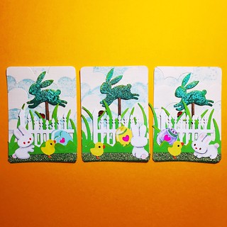
Happy Easter ATCs
Artist Trading Cards made from various die cut shapes, embellished with gel pens. The bunny topiary was covered with embossing ink, then dipped in beach sand and green enamel embossing powder and heated. Then repeated with just powder and highlighted with distress paint. Trimmed toothpick was stained with distress ink and glued to back.

Subscribe to:
Posts (Atom)